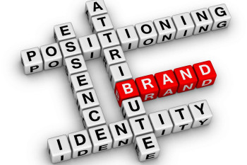
Let's be clear about a few things: your brand is not represented by your logo or website. The experience, perception, and reputation that people have of your services are all combined to form your brand. The steps you take to develop your brand are called branding (strategy).
However, your logo represents ownership, quality, and values, making it vital to your company's success. Your clients remember it more than your products, business card, website, or social media channels.
You have the chance to establish a good first impression, demonstrate that you provide a quality service, and visually convey your mission with your logo, which is likely to be one of the first interactions customers have with your business.
Different kinds of logos to choose from.
All of the visual symbols that represent your brand altogether are referred to as your logo. Five different types of logos exist. a wordmark made out of one or more solitary words, such as FedEx or Coca-Cola. A letter mark or abbreviation with only one letter: The two C's for Chanel or the A for Adobe come to mind. There is a logomark that consists solely of a symbol: For Mac products, picture the apple or the Nike Swoosh.
A wordmark, letter-mark, or logomark enclosed in a shape that is crucial to the design is what is known as an emblem. NHL and Harley-Davidson motorcycle logos are relevant examples of emblems. The last form is a combination mark, which combines a wordmark and a symbol or a wordmark and a letter.
What characteristics distinguish a strong logo?
A good logo should fit your business or service and seem acceptable. Usually, simpler is preferable if you run a professional services company rather than a product business. For clients, we frequently create wordmarks or typographic logos because that is all they truly require.
Logo creation is necessary to set you apart from the competition and promote brand loyalty. How? It is embedded with meaning. Why? Because your brand is based on the beliefs, fundamental values, purpose, mission, and vision of your company. Not your logo, but anything else that people talk about and remember.
People are genuinely interested in how they feel about your service and the values that your brand upholds. A good design communicates more than just a polished appearance on the surface.
Why do you need a logo for your company?
A quality logo builds trust and keeps visitors.
It describes your company, its services, and their benefits. It shows new customers that you do great work.
If your logo looks amateurish, customers will doubt your abilities. Have you ever returned or chosen a business because it seemed more trustworthy? People make rash decisions, and bad design drives people away.
To stand out to customers, make sure they remember your company, and foster favourable associations with you, create a powerful logo. People's memories and emotions are deeply symbolically related to logos.
Let's look at Nike as an illustration. Just a swoosh, that's all it is. We love that image because of their desire to transform the world via running. This strong philosophy defined their identity and helped them grow. Your logo ought to perform the same for your company over time and with lots of persistent brand marketing.
Spend money on your logo's design. It's crucial for boosting your credibility and attracting customers.
How do you design an effective logo?
For a startup to rapidly connect with its audience, its logo must be easy to understand and remember. It's crucial to keep your logo straightforward so that it functions across all media platforms and looks good in any size.
Unlike big businesses, most small brands don't have a long history of brand recognition that people identify with their products or services, nor do they typically have a sizable marketing budget to help customers understand what they do. Therefore, your logo must immediately project who you are and what you do.
There are several factors to take into account when reducing your brand to a single mark, from concept through roll-out. A superb small business logo, however, simply requires three things: excellent typography, muted colors, and a potent visual component.
Select typefaces that reflect your values.
When developing a logo or brand, the choice of typefaces and the way they are ordered are just as crucial as the use of colour, imagery, or graphics. Why? Because individuals use how a word looks to determine how it sounds to determine how they feel.
Emotional connection is sparked by strong branding. Your font should excite curiosity, instil trust, and promote optimism. Such emotions can be evoked by typography without the audience even being aware of it.
Typography is used to convey personality and tone of speech. Choose a font that expresses the values of your business, whether it be elegant, conventional, quirky, or modern.
Make sure the name of your business is legible and clear. Think about how your logo will be applied; examples include screens, letterheads, business cards, signage, and packaging. It must be readable both far away and close up. Additionally, if your logo contains a graphic element, make sure the typography complements the icon.
Do my typography's representation, communication, and visual appeal meet effective standards? If you didn't respond with a resounding "yes," it could be time for branding.
Make careful color choices.
Your logo's colour will influence how people see it and may even influence their choice to make a purchase. Color elicits feelings and conveys meaning. Additionally, using colour consistently across your marketing increases brand recognition by up to 80%.
The appropriate colors depend on your sector and target audience. You've definitely observed that some industries seem to favor particular hues. For instance, because blue symbolizes stability and dependability, banking companies frequently utilize blues. Blue is a color that brands use to encourage trust in their goods and services.
Based on the emotions and actions you want customers to have, choose your color or colors. Take into account context, culture, trends, and human psychology.
Your brand color should align with the objective of your Brand. It should convey your ideals and be distinctive enough to stand out from similar items in your niche.
The most influential brands have a straightforward color scheme with no more than three primary hues. Additionally, they implement solid hues instead gradients. Remember that color appears differently in print and on a screen. Make sure you can precisely duplicate your colors (Pantone, CMYK, RGB, Hex).
Use a straightforward symbol.
Despite the fact that 72% of the finest brand names are made up of words or acronyms, those names use typography to conjure an image in the mind of the reader. A similar objective can be achieved by using icons, symbols, and visual components.
Your logo becomes more interesting and memorable with a graphic component. It must hold a customer's interest for 10 seconds in order for them to remember it and form an opinion about it.
Some designers do this by changing the wording or including an illustrated icon that can stand alone in some circumstances. Ensure that every piece of art is unique and not a copy. Associating a visual cue with a word or phrase takes time and repetition.
The visual core of your brand identity is your logo.
Design matters and is necessary! Even more so if you want people to donate to you and spread the word about you. By investing in Branding, your business acquires the asset it needs to succeed.


